The latest trends in graphics
Like in fashion, trends in graphics come and go and as a T-shirt designer you should be aware of the shifts going on in the graphics industry. Therefore we prepared a summary of the styles, designs and fonts that are expected to take off this year.
Modern Retro:
Modern Retro signifies the revival of the late 80s and 90s. Early models of mobile phones, Gameboys, Discmans, cassette tapes, vinyl records and all types of video games now serve as logos on apparel and merchandising products. And it is not just the geeks who follow this trend. It is especially popular among 20-30 year olds that grew up with this technology because it evokes nostalgia in them.
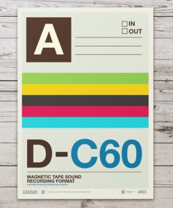
Big companies have already jumped on the bandwagon. A case in point is the Coca Cola group that launched a limited coke edition featuring space invaders of the 1978 arcade video game.
Material Design – Flat 2.0
Material Design, also referred to as Flat 2.0, is the evolution of the flat design movement that gained momentum in the early 2000s, when IT giants like Apple and Google devoted themselves to minimalism. All 3D, hollow or sunken elements that were formerly used to indicate customers that they could click on a graphic were removed. Unfortunately, as a consequence, the user experience deteriorated dramatically, which paved the way for Flat 2.0.
Flat 2.0 is still flat and minimalistic, however, bold and contrasting colors, large fonts and shadow effects are added to improve the user experience. And even though this design trends has its origin in the IT industry, material design principles also gained attention in the apparel industry. Leading trainer producer Nike banks on flat designs in its new collections.
Geometric shapes
The geo trend continues this year and is expected to become especially popular in packaging design. Triangles, rectangles and other geometric shapes are combined with 3D elements, a design that is aligned to the 80s.
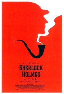
Minimalist Design
Minimalist design will never get out of fashion. It works best with two contrasting colors like black and white. Also contrasts in motives (round, square, yin-yang etc.) as well as Sans Serif typography are characteristic for minimalism.
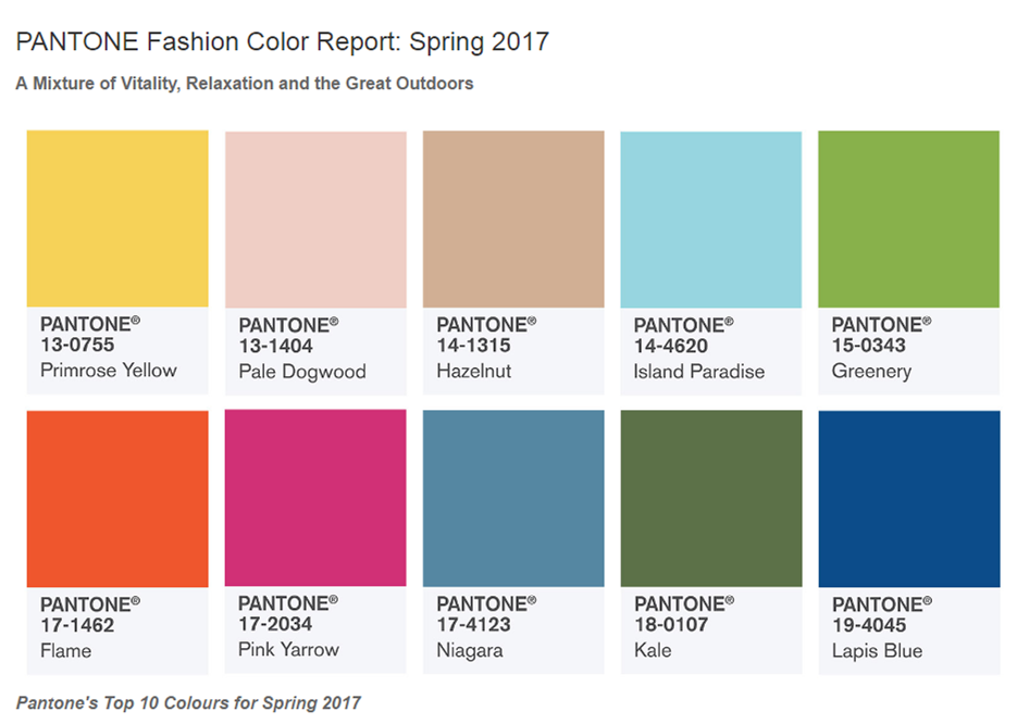
Colors
In line with the 80s trend, bright, bold and vivid colors are on the rise. Also electric colors will be more frequently used in 2016. Below there is a section of Pantone’s choice for the trend colors for spring 2017.
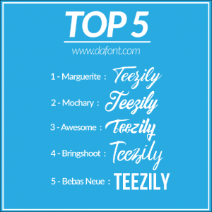
Dramatic typography
This year you should go for typography that grabs attention. It is all about bold, playful and dramatic typography that is making a statement. Drama can be created in different ways, through size, color, arrangement or texture. Below there are some links, where you can check out trendy fonts.
http://www.dafont.com/de/
https://www.fontsquirrel.com/fonts/list/hot
Modern Retro:
Modern Retro signifies the revival of the late 80s and 90s. Early models of mobile phones, Gameboys, Discmans, cassette tapes, vinyl records and all types of video games now serve as logos on apparel and merchandising products. And it is not just the geeks who follow this trend. It is especially popular among 20-30 year olds that grew up with this technology because it evokes nostalgia in them.
Big companies have already jumped on the bandwagon. A case in point is the Coca Cola group that launched a limited coke edition featuring space invaders of the 1978 arcade video game.
Material Design – Flat 2.0
Material Design, also referred to as Flat 2.0, is the evolution of the flat design movement that gained momentum in the early 2000s, when IT giants like Apple and Google devoted themselves to minimalism. All 3D, hollow or sunken elements that were formerly used to indicate customers that they could click on a graphic were removed. Unfortunately, as a consequence, the user experience deteriorated dramatically, which paved the way for Flat 2.0.
Flat 2.0 is still flat and minimalistic, however, bold and contrasting colors, large fonts and shadow effects are added to improve the user experience. And even though this design trends has its origin in the IT industry, material design principles also gained attention in the apparel industry. Leading trainer producer Nike banks on flat designs in its new collections.
Geometric shapes
The geo trend continues this year and is expected to become especially popular in packaging design. Triangles, rectangles and other geometric shapes are combined with 3D elements, a design that is aligned to the 80s.
Minimalist Design
Minimalist design will never get out of fashion. It works best with two contrasting colors like black and white. Also contrasts in motives (round, square, yin-yang etc.) as well as Sans Serif typography are characteristic for minimalism.
Colors
In line with the 80s trend, bright, bold and vivid colors are on the rise. Also electric colors will be more frequently used in 2016. Below there is a section of Pantone’s choice for the trend colors for spring 2017.
Dramatic typography
This year you should go for typography that grabs attention. It is all about bold, playful and dramatic typography that is making a statement. Drama can be created in different ways, through size, color, arrangement or texture. Below there are some links, where you can check out trendy fonts.
http://www.dafont.com/de/
https://www.fontsquirrel.com/fonts/list/hot